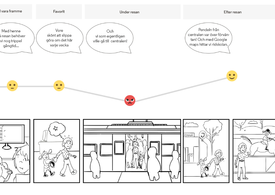
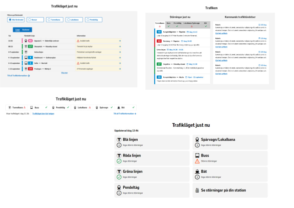
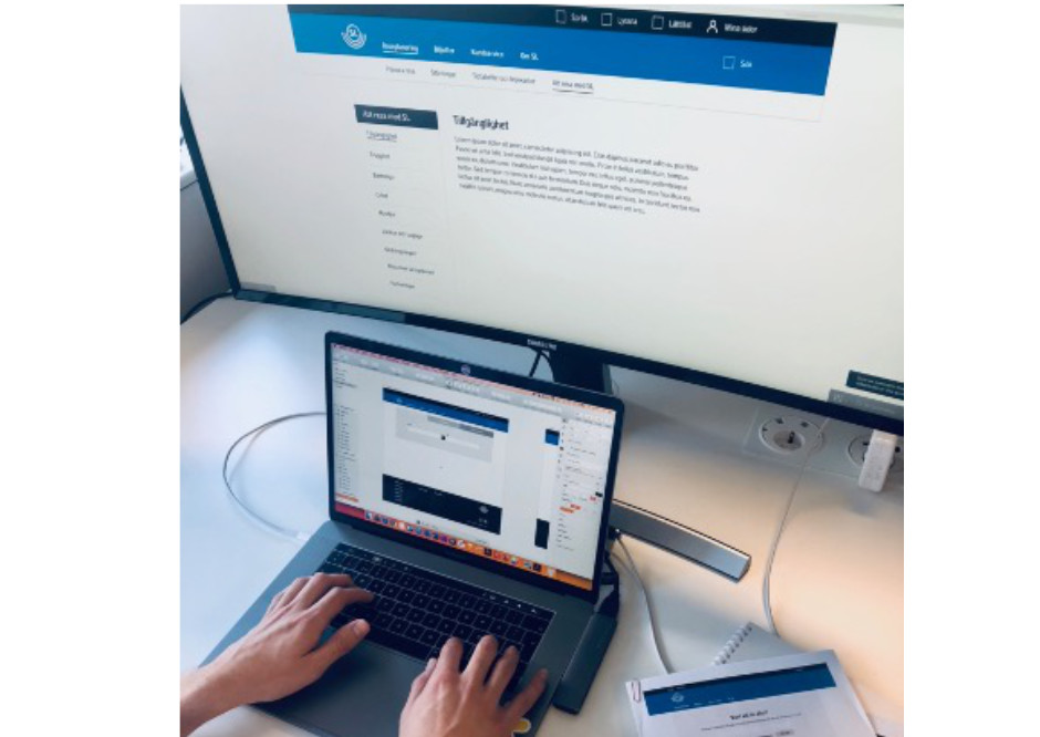
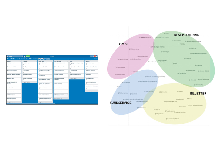
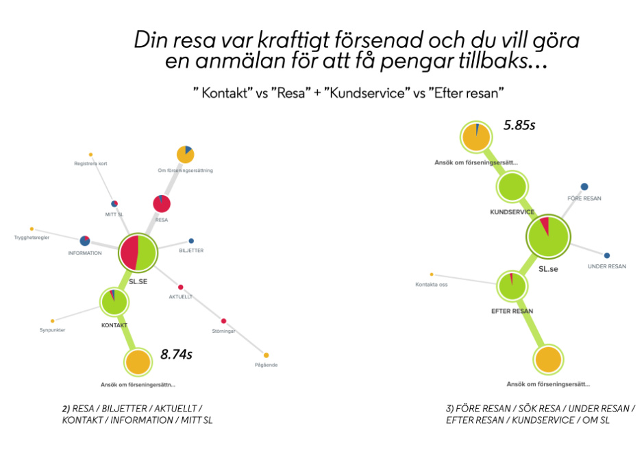
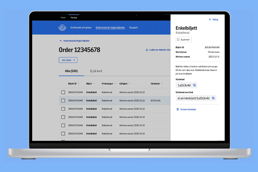
For SL, I served as Design Lead as a consultant from TietoEVRY in the development of the new sl.se. The project was not just about visual redesign--it involved structuring, testing, and improving a complex information system used by millions of people.
I led the work throughout the entire product development lifecycle using a hypothesis-driven, user-centered approach. To understand how people actually used the service, we mapped behaviors and needs through interviews, workshops, and user testing--both in real traffic environments and in more controlled test settings. A key part of my role was translating insights into concrete, testable concepts and prototypes that could be validated and iterated upon. I also contributed to building a scalable design system, enabling consistent and efficient implementation in close collaboration with the development team. Accessibility according to WCAG was treated as a fundamental design parameter and integrated into the overall system thinking, rather than as a separate checkpoint at the end of the process.
Design work was performed in 2-3 week long sprints. Every sprint included a design workshop with the customer (SL) and other stakeholders such as developers. User insights was collected in almost every sprint. Below are described some of the user centered design methods that's been part of the design work.
In the start of the project, we created several user journeys in order to describe and focus on the different user needs and experiences. The journeys were based on data such as personas (which SL hade generated since earlier), deep interviews about travel behavior and experience, and user testing on the previous SL website. I made the user journeys come to life by drawing storyboards and they became a way to keep focusing on the users through the whole design project.
We most often made multiple designs for design problems. This was a way to keep the designs divergent and not converge too early into our own design ideas. We showed, discussed and tested the alternative designs with users and could by that deepen our understanding about the most promising design path.
Through the design work, hundreds of user insights have been analyzed. User testing have been one way to get user insights. We performed user testing on mobile prototypes with travelers at subway platform, bus stops etc. Other types of user testing was performed at the office by the computer in more controlled tests.
We used quantitative methods to analyze some of the design hypotheses. Examples of this are experiments comparing designs by letting travelers at subways platforms or bus stops, solve tasks with mobile prototypes. Different groups were instructed to use different designs. In this way we could collect user data fast and thereby understand if any design was significantly better or worse that the others. In the image below the experiment considered task time on a light- vs dark graphical design in the actual subway millieu. We also performed more quantitative studies such as card sorting with factor analysis and tree testing.
How the web was strucured was based on the users mental models, which we could get insight into through card-sorting. A number of users were, one at the time, instructed to sort different travel-themes into groups in the way they considered right. Factor analysis was used in order to find recurrent, general groups, that should be suitable to use as e.g. main navigation etc.
Tree teesting was a way to compare alterantive hypotheses regarding structure of the web. We tested several variants of main navigation and could thereby find the one that was fastest to find content with, and brought with it least amount of errenous navigation.
A design system and style guide were created in Sketch. This facilitated to make ui design consistent.
Accessibility was an important part of the design work. We applied WCAG level 2 and did accessibility tests in cooperation with the Swedish Association of Visually Impaired People.
Hypothesis-driven UX where quantitative analysis and problem matrices were used to prioritise design decisions and demonstrate business impact.
More about New company website for SL
Experimented with AI-generated themes in a word game and tested how design and cognitive load affect users' decision tempo.
More about Measurable UX in a word game: Vue, AI-generated themes, and decision tempoConcept development and frontend implementation, with campaigns and newsletters designed and built at scale.
More about UX at CoopUX in complex systems, where prototypes were used as tools to align business, technology, and requirements.
More about Digitalization of social systemsUX and design systems for Telia, where structure, visual design, and component thinking were aligned within product development.
More about BredbandswebbenUser research and personas, where interviews and storyboards were used to understand the needs of older adults.
More about Greta and TorstenInteraction design and development of a platform that matches students with companies.
More about Student career
Experimental UX study investigating how moving tiles in an interface can support thinking and problem-solving.
More about Embodied UX in a word game: moving letter tiles as a cognitive strategy